Approved Colors
These colors are approved for text overlay only at the sizes and colors defined to maintain compliance with the WCAG 2.0 guidelines.
- AA designated text overlay must be 18px or greater.
- AAA designated text overlay must be 12px or greater.
- HEX (#) colors should be used when designing websites.
- CMYK colors should be used when designing for 4-color printing.
- RGB colors should be used when designing graphics for digital signage and projection. Photos and graphics should also be converted to RGB for web use.
- Photographs should be converted to CMYK for printing.
- Pantone colors are provided if needed for printing.
Introduction
Color plays a crucial role in shaping the visual identity and usability of our product. This color palette ensures consistency, accessibility, and emotional clarity across all user interfaces. Each color in the system has been carefully chosen to support a harmonious aesthetic while serving specific functional roles.
Consider red as your friend when making color choices for publications. The official colors of the University of Arkansas are cardinal and white. Because of the requirements for printing and the need to be as specific as possible when matching colors, the Pantone® Matching System (PMS) number for cardinal red is 201.
This guide defines the correct usage of our primary and suggested secondary colors, outlines restricted usage, and provides direction on how to effectively use color to enhance user interface (UI) communication. While you are not limited to these colors, your work must adhere to the guidelines below.
Primary vs. Secondary Color Usage
Maintaining a clear distinction between primary and secondary colors is vital to creating a cohesive and accessible visual narrative.
Primary Colors
Our primary colors define the core identity of the brand and are used most prominently across UI components. These colors are used for key interactive elements, navigation, and brand reinforcement.
Usage Guidelines:
-
- Key Elements: Apply primary colors to core components such as main buttons, navigation bars, and feature backgrounds.
- Brand Consistency: Adhere strictly to the defined HEX/RGB values to ensure consistency, whether on digital platforms or printed materials.
- Emotional Impact: Leverage the psychological impact of these colors to evoke the intended brand emotions.
Approved primary colors and text overlays appear below.
Cardinal Red
#9D2235
bg-uark-red
Normal Text (16px):
- FFFFFF (AAA)
- F2F2F4 (AA)
- C7C8C9 (AA)
Large Text (24px):
- FFFFFF (AAA)
- F2F2F4 (AAA)
- DDBA96 (AA)
- 9DC9D5 (AA)
- C7C8C9 (AAA)
Apple Blossom
#FFFFFF
bg-apple-blossom
Normal Text (16px):
- 9D2235 (AAA)
- 000000 (AAA)
- 464648 (AAA)
- 492D14 (AAA)
- 0F3842 (AAA)
Large Text (24px):
- 9D2235 (AAA)
- 000000 (AAA)
- 464648 (AAA)
- 492D14 (AAA)
- 0F3842 (AAA)
- 957552 (AA)
- 3E94AA (AA)
Black Whetstone
#000000
bg-black-whetstone
Normal Text (16px):
- FFFFFF (AAA)
- F2F2F4 (AAA)
- DDBA96 (AAA)
- 9DC9D5 (AAA)
- C7C8C9 (AAA)
- 957552 (AA)
- 3E94AA (AA)
Large Text (24px):
- FFFFFF (AAA)
- F2F2F4 (AAA)
- DDBA96 (AAA)
- 9DC9D5 (AAA)
- C7C8C9 (AAA)
- 957552 (AAA)
- 3E94AA (AAA)
Quartz
#F2F2F4
bg-quartz
Normal Text (16px):
- 9D2235 (AA)
- 000000 (AAA)
- 464648 (AAA)
- 492D14 (AAA)
- 0F3842 (AAA)
Large Text (24px):
- 9D2235 (AAA)
- 000000 (AAA)
- 464648 (AAA)
- 492D14 (AAA)
- 0F3842 (AAA)
- 957552 (AA)
- 3E94AA (AA)
Buckskin
#DDBA96
bg-buckskin
Normal Text (16px):
- 000000 (AAA)
- 464648 (AA)
- 492D14 (AA)
- 0F3842 (AA)
Large Text (24px):
- 9D2235 (AA)
- 000000 (AAA)
- 464648 (AAA)
- 492D14 (AAA)
- 0F3842 (AAA)
Clearsky
#9DC9D5
bg-clearsky
Normal Text (16px):
- 000000 (AAA)
- 464648 (AA)
- 492D14 (AAA)
- 0F3842 (AAA)
Large Text (24px):
- 9D2235 (AA)
- 000000 (AAA)
- 464648 (AAA)
- 492D14 (AAA)
- 0F3842 (AAA)
Spoofer's Stone
#464648
bg-spoofers-stone
Normal Text (16px):
- FFFFFF (AAA)
- F2F2F4 (AAA)
- DDBA96 (AA)
- 9DC9D5 (AA)
- C7C8C9 (AA)
Large Text (24px):
- FFFFFF (AAA)
- F2F2F4 (AAA)
- DDBA96 (AAA)
- 9DC9D5 (AAA)
- C7C8C9 (AAA)
Bauxite
#492D14
bg-bauxite
Normal Text (16px):
- FFFFFF (AAA)
- F2F2F4 (AAA)
- DDBA96 (AA)
- 9DC9D5 (AAA)
- C7C8C9 (AAA)
Large Text (24px):
- FFFFFF (AAA)
- F2F2F4 (AAA)
- DDBA96 (AAA)
- 9DC9D5 (AAA)
- C7C8C9 (AAA)
- 3E94AA (AA)
Storm Cloud
#0F3842
bg-storm-cloud
Normal Text (16px):
- FFFFFF (AAA)
- F2F2F4 (AAA)
- DDBA96 (AA)
- 9DC9D5 (AAA)
- C7C8C9 (AAA)
Large Text (24px):
- FFFFFF (AAA)
- F2F2F4 (AAA)
- DDBA96 (AAA)
- 9DC9D5 (AAA)
- C7C8C9 (AAA)
- 3E94AA (AA)
Secondary and Tertiary Colors
Secondary and Tertiary colors support the primary palette and offer variety and flexibility without overwhelming the brand. These should be used sparingly to support UI hierarchy and feedback.
Usage Guidelines:
- Accents and Highlights: Employ secondary colors for supporting elements such as secondary buttons, icons, infographics, and background accents.
- Visual Hierarchy: Use them to subtly differentiate lesser actions, ensuring the primary colors remain dominant in call-to-action contexts.
Approved secondary colors and text overlays appear below. These colors may be used to enhance a design but should not dominate it. It is important to maintain a sense of hierarchy, balance and harmony when using the UARK web color palette. Our color system is flexible, but please use restraint. Unique color palettes can be created from one or two colors in addition to the primary palette.
Silverleaf
#C7C8C9
bg-silverleaf
Normal Text (16px):
- 9D2235 (AA)
- 000000 (AAA)
- 464648 (AA)
- 492D14 (AAA)
- 0F3842 (AAA)
Large Text (24px):
- 9D2235 (AAA)
- 000000 (AAA)
- 464648 (AAA)
- 492D14 (AAA)
- 0F3842 (AAA)
Hickory
#957552
bg-hickory
Normal Text (16px):
- 000000 (AA)
Large Text (24px):
- FFFFFF (AA)
- 000000 (AAA)
- F2F2F4 (AA)
Springwater
#3E94AA
bg-springwater
Normal Text (16px):
- 000000 (AA)
Large Text (24px):
- FFFFFF (AA)
- 000000 (AAA)
- F2F2F4 (AA)
- 492D14 (AA)
- 0F3842 (AA)
Prohibited Colors
Certain colors must be avoided to uphold the integrity of our brand and ensure readability across all applications. The following colors are not allowed for the sake of brand consistency, legibility, and accessibility.
- High-Contrast Conflicts: Colors that create visual discord or discomfort—such as neon shades or overly saturated hues not part of the approved palette—must not be used.
- Prohibited Colors: Orange, Teal, Purple, Pink, Alternative Reds, Lighter and darker versions of cardinal red
- Review Process: Ensure every new design is cross-checked against this document and approved by University Relations.
Examples of Using Colors Poorly:
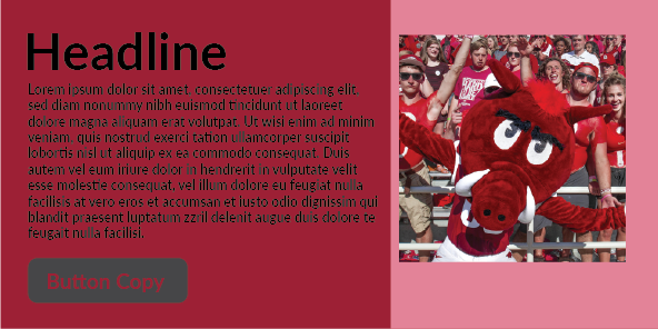
Issue: pink is a restricted color, there is a lack of contrast between the background and the typography
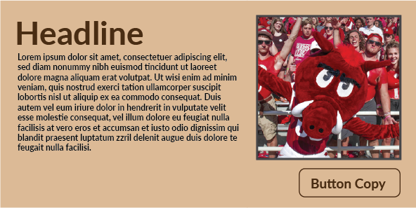
Issue: no UARK red in the design. The secondary colors need to compliment the UARK red, not ignore it.
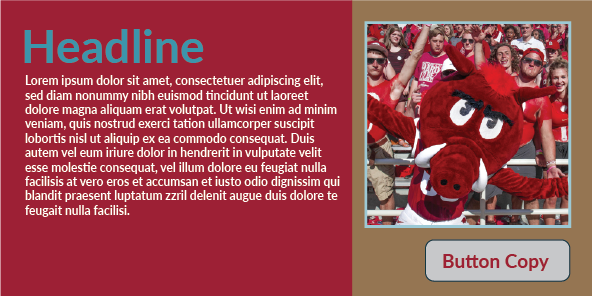
Issue: too many colors creates visual noise and a lack of contrast for the typography
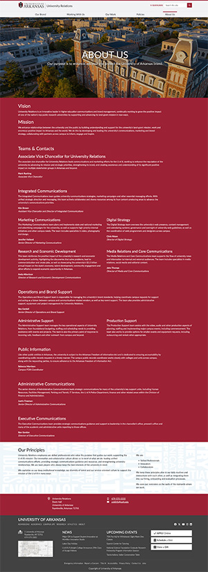
Issue: too much red overloads the page, compare the real University Relations About Us page for an example of color background variation:
Designers are encouraged to consult this guide regularly, and any deviations should undergo a formal review to ensure compliance with our visual identity standards.
Using Colors to Communicate UI
Colors are powerful communicators when used strategically within an interface. Here’s how to harness their potential:
Status Indicators:
- Success: Use approved green tones (e.g., Primary Green) to signal successful actions or confirmation messages.
- Error: Apply consistent red hues (e.g., Primary Red) to denote errors or warnings, ensuring they grab attention instantly.
- Information: Utilize calmer colors like a designated light blue or neutral shades to present informational content without overwhelming the user.
Interactivity:
- Actionable Elements: Reserve primary colors for elements that require immediate attention, such as active buttons or key interactive components.
- Hover and Active States: Employ subtle variations (in brightness or saturation) of the UI colors to clearly indicate hover or active states, enhancing user feedback.
- Disabled Components: Use muted or desaturated tones to denote inactive or unavailable options, thereby setting clear expectations.
Accessibility Considerations: Ensure sufficient contrast ratio between foreground and background (aim for WCAG 2.1 AA at minimum).
- Contrast and Legibility: Always ensure proper contrast ratios between text and background. Design elements must meet or exceed WCAG guidelines to support users with varied visual abilities.
- Consistency Across Devices: Verify that color usage remains effective and consistent in different lighting conditions and on diverse screens (desktop, mobile, print).
- Use tools like WebAIM Contrast Checker
- Avoid using color as the only way to convey information—pair it with icons or text where needed
Print & Digital Publications
Publications should be predominantly themed in Cardinal red in order to clearly indicate that the piece is part of the University of Arkansas family of publications. Cardinal red connects our audiences to the campus and while other colors may be pretty, they may inadvertently create the impression they are associated with other institutions.
When designing for print, you must create colors using either PMS or CMYK numbers. Do not use RGB or HEX numbers, they will not convert correctly for print purposes.